The Within (FE) Estimator Visualized
By Bas Machielsen
February 22, 2021
Introduction
In this post, I will visualize what the FE-estimator does by benchmarking it to the OLS estimator. I use World Bank data on trade and GDP per capita to estimate (i) a regression equation with OLS, (ii) describing the procedure involved in estimating the FE coefficient and (iii) visualize what that means in this specific setting.
Downloading the Data
First of all, we make use of the WDI package in R to download some (admittedly, pretty random) World Bank data. The WDI has a search function, which you can use this the command WDI::WDIsearch("Your search here"). After having found the variable to your liking, you can save the ID, and execute a query in the following way:
library(WDI)

data <- WDI::WDI(indicator = c("NY.GDP.PCAP.CD",
                               "BG.GSR.NFSV.GD.ZS"),
                 country=c('FR','CA','US'),
                 start=1979,
                 end=2012)
After which the data is written to an initial data frame, data.
OLS and Visualizing
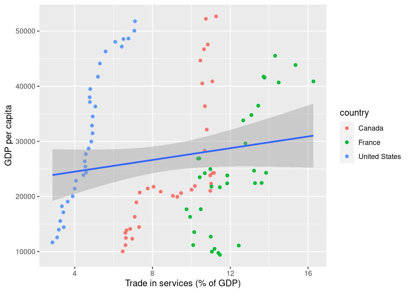
I clean the variable names briefly (I don’t like caps), and then I show what happens if you estimate OLS on these data:
library(tidyverse); library(janitor)

data <- data %>%
    as_tibble() %>%
    janitor::clean_names()

data %>%
    ggplot(aes(x = bg_gsr_nfsv_gd_zs,
               y = ny_gdp_pcap_cd)) +
    geom_point(aes(group = country,
               color = country)) +
    geom_smooth(method = "lm") +
    xlab("Trade in services (% of GDP)") +
    ylab("GDP per capita")

For clarity’s sake, I put observations coming from different countries in different colors. Hopefully, this makes intuitively clear what is going on: by pooling all observations, the least-squares line is way off, because it doesn’t consider that the data consists of groups (countries) over time. The fixed effects estimator is a solution to this problem. To start with, the fixed effects estimator transforms the data to a time-demeaned version. Mathematically, that looks as follows. We start with a panel model:
$$ Y_{it} = \alpha_0 + X_{it} \beta + \alpha_i + u_{it} $$
where \(\alpha_i\) are fixed effects. In this specific case, we are considering countries, so you can think of the \(\alpha_i\) as being country-specific GDP levels. Usually, we normalize the model such that \(\alpha_0 = 0\).
Time-Demeaning
Then, we consider all observations relative to their country-specific mean. That process is called time-demeaning. Mathematically, it looks as follows, where \(\bar{Y_i} = \sum_{t=1}^{T} Y_{it}\), and the other bar-variables are defined in the same way:
$$
Y_{it} - \bar{Y_i} = \beta (X_{it} - \bar{X_i}) + (\alpha_i - \bar{\alpha_i}) + (u_{it} - \bar{u_i})
$$
Pay close attention to the \(\alpha_i - \bar{\alpha_i}\) part. What does it say? What is \(\bar{\alpha_i}\)? The time-demeaned version of the data takes ‘away’ the variation that exists between groups ($\alpha_i$) and considers only the variation within groups, and then estimates the least-squares (OLS) line!
More concretely, what we do is this. First, we construct the per-group mean for each variable:
data2 <- data %>%
    group_by(country) %>%
    mutate(bg_gsr_nfsv_gd_zs_bar = bg_gsr_nfsv_gd_zs - mean(bg_gsr_nfsv_gd_zs),
           ny_gdp_pcap_cd_bar = ny_gdp_pcap_cd - mean(ny_gdp_pcap_cd))
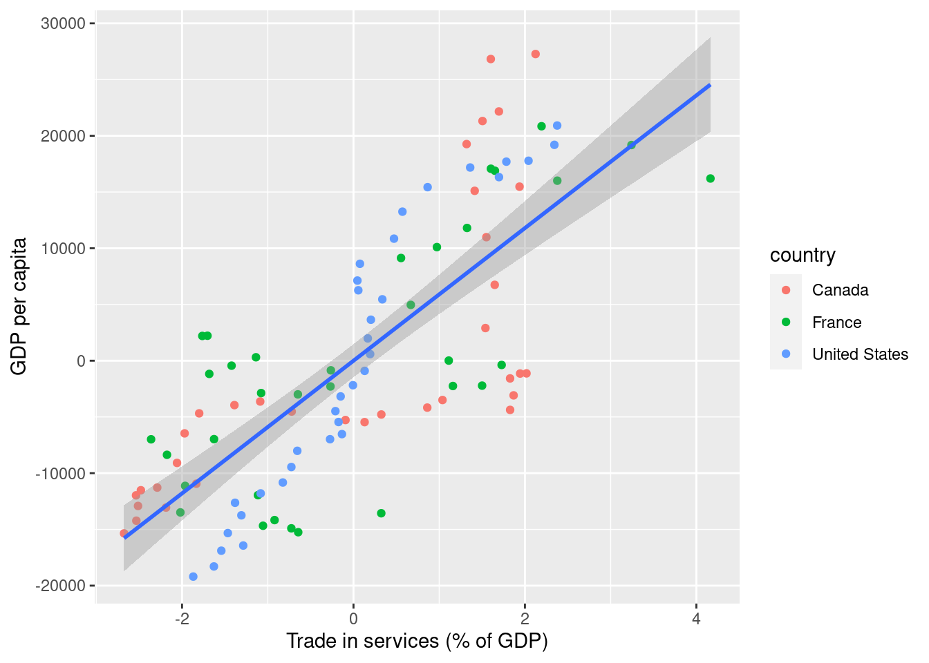
Now, the data looks as follows:
data2 %>%
    ggplot(aes(x = bg_gsr_nfsv_gd_zs_bar,
               y = ny_gdp_pcap_cd_bar)) +
    geom_point(aes(group = country,
                   color = country)) +
    geom_smooth(method = "lm") +
    xlab("Trade in services (% of GDP)") +
    ylab("GDP per capita")

That looks much more comparable. In fact, this line makes use of the variance within country instead of between countries! The line that is drawn through the figure is the OLS-line, which is exactly the estimate of the slope we are looking for. I now extract this coefficient, for future reference.
#Extracting the coefficient
coefficients <- lm(data = data2,
   formula = ny_gdp_pcap_cd_bar ~ bg_gsr_nfsv_gd_zs_bar)$coefficients[2]
The coefficient is equal to 5897.7582819.
Interpreting the estimates
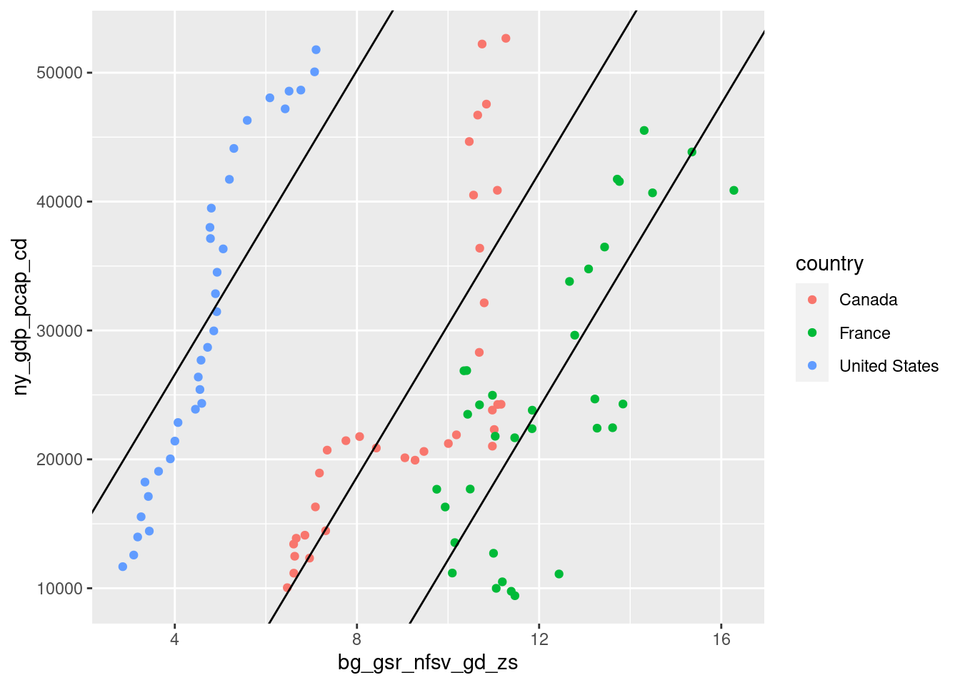
The \(\alpha_i\), even though they aren’t considered in calculating the slope of the line, are still being estimated. We can go back to the \(\alpha\)’s by looking at the first-order conditions of fixed effects estimation, from which we can calculate that \(\bar{\alpha_i} = \bar{Y_i} - \bar{X_i}\beta\). For each country in the dataset, then, we have a unique \(\alpha_i\), a country-fixed effect. Together with the slope we have just calculated they should now accurately describe the data. Let’s check to see whether that is true:
data3 <- data2 %>%
    mutate(intercept = mean(ny_gdp_pcap_cd) - coefficients*mean(bg_gsr_nfsv_gd_zs))

data3 %>%
    ggplot(aes(x = bg_gsr_nfsv_gd_zs,
               y = ny_gdp_pcap_cd)) +
    geom_point(aes(group = country,
                   color = country)) +
    geom_abline(intercept = data3$intercept, slope = coefficients)

Comparison with package
The plm package allows you to do fixed effects regression right away, without dealing with these transformations. Let’s check and see if the output matches the results we derived in this blog post:
library(plm) ; library(stargazer)

plm(data, formula = "ny_gdp_pcap_cd ~ bg_gsr_nfsv_gd_zs",
    model = "within",
    index = c("country", "year")
    ) %>%
    stargazer(type="html",
              omit.stat = c("f", "ser"))
| Dependent variable: | |
| ny_gdp_pcap_cd | |
| bg_gsr_nfsv_gd_zs | 5,897.758*** |
| (483.567) | |
| Observations | 102 |
| R2 | 0.603 |
| Adjusted R2 | 0.591 |
| Note: | *p<0.1; **p<0.05; ***p<0.01 |
- Posted on:
- February 22, 2021
- Length:
- 4 minute read, 758 words
- See Also: